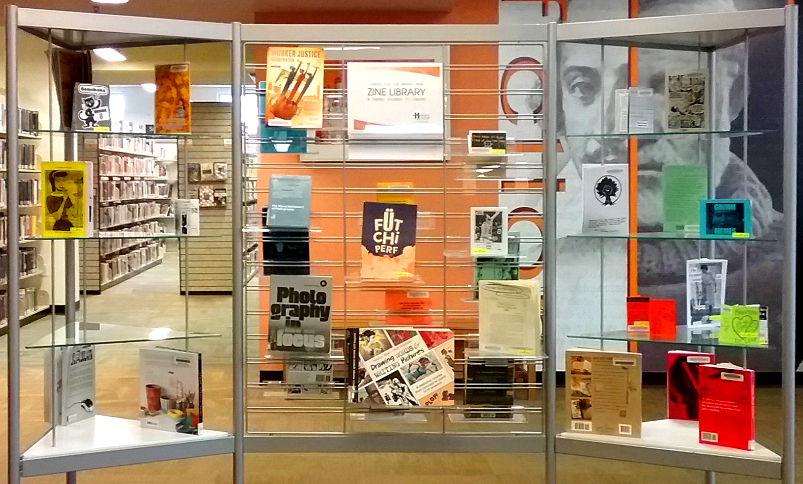
zine, [zeen] noun. 1. abbr. of fanzine; 2. any amateurly-published periodical. Oxford Reference

..

Showing posts with label ccs. Show all posts

Saturday, July 13, 2013

Beauty Patrol


By Cody Roder

I recently read something online somewhere (on the Comics Reporter maybe?) that talked about graduates from the Center for Cartoon Studies. The person (whoever they were) wrote about how the center was turning out comics graduates who may know something about putting together a comic, but are still just making minicomics and webcomics with the hope that something will catch on and they'll have a career.

This comic really reminded me of that idea, because while this comic may have a pretty cool cover, the interior is generally confusing and not particularly coherent. At least part of this is because the comic contained within is at least partially a "daily diary comic" (or at least that's what it says on the final page), but I never would have guessed that.

Instead we have characters who wander around doing not much, and spend a lot of time thinking about and discussing various philoso-physics concepts. There is definitely a place in comics for discussions about entropy, particles, time and space, and similar things, but I don't think its place is in comics that use nine panel grids where the art barely changes between panels, and the dialogue is disjointed and sentences are strung out across pages.

I think ultimately I just don't understand why this comic was printed. Not why it was made, because making any sort of art can help you get to grips with your thoughts and you have to work on your art to get better. But I just don't really know who the audience for a comic like this is.


(Originally written for 365 Zines a Year.)

Wednesday, April 11, 2012

Beauty Patrol


By Cody Roder

I recently read something online somewhere (on the Comics Reporter maybe?) that talked about graduates from the Center for Cartoon Studies. The person (whoever they were) wrote about how the center was turning out comics graduates who may know something about putting together a comic, but are still just making minicomics and webcomics with the hope that something will catch on and they'll have a career.

This comic really reminded me of that idea, because while this comic may have a pretty cool cover, the interior is generally confusing and not particularly coherent. At least part of this is because the comic contained within is at least partially a "daily diary comic" (or at least that's what it says on the final page), but I never would have guessed that.

Instead we have characters who wander around doing not much, and spend a lot of time thinking about and discussing various philoso-physics concepts. There is definitely a place in comics for discussions about entropy, particles, time and space, and similar things, but I don't think its place is in comics that use nine panel grids where the art barely changes between panels, and the dialogue is disjointed and sentences are strung out across pages.

I think ultimately I just don't understand why this comic was printed. Not why it was made, because making any sort of art can help you get to grips with your thoughts and you have to work on your art to get better. But I just don't really know who the audience for a comic like this is.


(Originally written for 365 Zines a Year.)

Saturday, January 21, 2012

Automatons in Love


By Jesse Durona, CJ Joughin, Kevin Uehlein, and Carl Mefferd
kevinuehlein.wordpress.com
piratesvsquid.blogspot.com

Robots! Robots! Robots! I love robots so much. And this zine is beautifully put together, with a silver cut out cover, pages printed on clear plastic, and occasional spot colour. It all looks really nice!

The four stories in here are pretty varied, and while all of them feature robots, not all of them really fulfill the title criteria. I was a little disappointed by this, as I've recently been reading Pluto by Naoki Urasawa. It's a fantastic comic about what it means to be a robot and a human, artificial intelligence, and how the two groups would interact with each other as robots get steadily more advanced. I've just read the first six books and I'm (im)patiently waiting for volume seven to come in at the library so I can finish reading the series.

So back to this comic! The first story, by Durona, appears to be from their webcomic that no longer exists. It's a cute little story about a robot who befriends some monkeys. Rad! I like the way the various apes are drawn, though I don't enjoy the human's designs as much.

Joughin's comic is an interesting one about consumerism and wants vs needs. However, while I liked the idea behind the comic, the actual story didn't really grab me. The pencil only (I think) art didn't reproduce that well either, so maybe Joughin should work on either their inking or digital manipulation skills to ensure better reproduction next time.

Uehlein's comic was my favourite out of all of them. The art is reminiscent of old funny animal cartoons (in no small part because most of the characters are animals in fancy clothes), and the plot of a robot performing cello in an orchestra seems like something that would fit right into an animated short. The comic is almost entirely silent, and one of my few wishes is that Uehlein had made the entire comic without anybody speaking. Still, it's pretty awesome in general.

The final comic, by Mefferd, features some really good robot designs. However the story doesn't really grab me for some reason. Maybe it's the pages of build up for what turns out to be a fairly old joke.

Overall though, this is a well put together anthology that features a variety of different styles. It's worth checking out even if you're not a huge robot fan (or a fan of huge robots).


(Originally written for 365 Zines a Year.)

Sunday, January 8, 2012

Things I Wonder About but Don't Really Want to Know the Answers to


By Nomi Kane
www.brewforbreakfast.com

This short zine features a number of drawings representing various things Kane has thought about, but doesn't really want to know the answer to. Just like the title says!

They're all pretty funny, and several of them are things I've thought of myself. (Especially "How long has this been in the fridge?".) There isn't a lot of room for Kane's art to really be seen, but what is there is attractive. I do wonder about the way she draws herself, always with the same sort of worried/sad look on her face. I hope she is more cheerful in real life!

(Originally written for 365 Zines a Year.)

Monday, April 25, 2011

l'âge dur


By Max de Radiguès
www.maxderadigues.com

This is a cute little set of five minicomic bound together with a paper band. The comics focus on small events from teenage life. The characters skateboard, ride bicycles, get into fights, lust after girls, and the like.

As a Belgian de Radiguès's art is clearly influenced by the clear line style popularized Hergé, but there are aspects of other creators in here too. His large eyed females remind me of somebody. The name is on the tip of my brain. I was going to say Hope Larson, but I just looked her up and while her characters do seem to have large eyes, the rest of the art style isn't the same. Dang, this is going to bug me for ages.

Uhm, so anyway, the way de Radiguès draws boys and girls in his comic, combined with the stories he tells, really separates them into two groups. The girls seem knowledgeable, worldly, and sophisticated, while the boys seem little more than children. Even those boys that do manage to achieve any kind of connection with the girls are seen as having skills and knowledge beyond the norm.

These comics have thus captured some of the awkwardness prevalent in being a teenager. Not knowing what to do, not knowing what you're doing right, and not knowing how to get what you want.

Though, I say that's prevalent in teenagers, but I'm pretty sure I still deal with all those problems on a daily basis.

(This review was originally published on 365 Zines a Year.)

Thursday, March 3, 2011

Myrtle-Willoughby


Edit! According to a commenter this is by MK Reed (mkreed.com), whose comic I just avoided buying on the weekend. If only I'd had the info 24 hours earlier! Let that be a lesson to you creators, always include your name.


I have no idea who made this comic since there's no contact information or anything included. This is too bad, since I thought it was pretty good and used a pretty cool way to tell a story.

In the comic each page is filled with a single image. This image represents one event in the day of a number of different characters (well, a couple are two pagers, but for the most part they're all single pages). Over the 50 pages included here we're able to see the personalities of these characters, and the realtionships between them, develop and grow.

Because we're only seeing one single moment from each day of these character's days there so much that we miss out on and our minds are forced to fill in the blanks. Sure, sometimes I hate that, but somehow it works really well here. Maybe it's the fact that I feel as though I would like the main characters, though because so much of their lives exists only in my head I could just be inserting character traits I enjoy.

The story isn't a new one, it's just people living their lives, working boring jobs, going to parties, trying to find similarly minded people to hang out and sleep with. But I guess that's the majority of fiction isn't it? Sometimes I forget that most media isn't people shooting lasers at computer generated constructs. *ZZZKKOWWW!!*

I don't think the story in here is true, I think it's just heavily based on real-life experiences that the author (and their friends) have had. Even if the exact events haven't happened to you, similar ones have happened to people you know.


(This review was originally published on 365 Zines a Year.)

Tuesday, March 1, 2011

These Things Happen Vol. 4


By Sam Carbaugh
www.samcarbaugh.com

The first story in this comic is about being on a long distance bus journey. Not exactly the most thrilling of events, but then Charles Bukowski appears and starts berating Carbaugh to stop being so romantic and pathetic about the concepts of beauty and art.

I'm not really that knowledgable of Bukowski, but this version asks Carbaugh "Why should other people give a shit?" about his work, and sometimes that's a good question to ask. Why are you creating something? Though creating solely for arts sake is fine, perhaps the better question is if you are putting something out into the world, why should anyone pay attention to it?

Bukowski then continues to rip into some well known poets and says that you need to be attacked and hurt by life before you can be a proper poet. Guess it's a good thing I don't want to be a poet.

(Speaking of Bukowski, and of me not really getting poetry unless I hear it read, here's a killer track by DOOM that features an extensive sample of Bukowski reading one of his poems. I'm sure the background music helps, but still: solid.)

The comic then takes a rather odd turn as it flashes forward several years and shows Carbaugh reading an old journal and contemplating over how he's changed in the last few years. This part is straight up journal comics, and is less interesting to me. Two people talking about a phone conversation one of them had isn't going to thrill me unless I happen to know one of the people involved (and even then maybe not...).

The other two comics in here are a somewhat meta one about a strange character getting their arm stuck on the wrong side of a panel border. It's a good idea, but I found some of the stylistic choices kind of strange. The final piece is about how being the same as everyone else isn't that awesome or something. I'm bad at explaining the plot of this, but it's not exactly a new idea.

I like Carbaugh's art, though really I'm a sucker for zippatoned backgrounds and textures. For the more cartoony stuff he has a pretty good grasp of character design, and I like the weird skull-headed bird that appears.


(This review was originally published on 365 Zines a Year.)

Monday, February 28, 2011

Double Think #8


By Matt Aucoin

I don't get doodle zines/minicomics. I mean, if you're going to go to the effort of photocopying, folding, and stapling something, why do it for something you've just drawn really quickly? I mean, I know I read Cat and Meringue, Snake Pit, and other similar comics. But as short strips they function in a different way. If produced as a minicomic you're going to get several complete strips per page. Amazing!

In contrast this comic sometimes has only one panel vaguely floating in the middle of a page as part of a multi page story. Like, maybe that anecdote's funny, but the way it's told just seems weird.

I'm not saying that Aucoin is a bad artist, but I'm saying that the art represented here clearly isn't using his full skills. It mostly just seems like notebook doodlings, which isn't really my sort of thing.

(This review was originally published on 365 Zines a Year.)

Friday, February 25, 2011

The Legend of Johnny Rocker


By Beth Hetland

The town of Bramble is in trouble! An evil giant rock god has come to their town, and has summoned eternal rain storms with his incredible bass guitar skills. Only one man can stop him, disaffected teenager Jonathon Reader!

In many ways this comic can be seen as a love letter to the '80s. The terrible haircuts, the fashion, the guitar solos, the references to David Hasselhoff, and even the unicorns all yell "1980s!" to me. And while I love many aspects of the 1980s (mostly related to old videogames), the aspects used in this comic aren't ones I'm particularly fond of (ie. I'd rather listen to NES style chip tunes than hair metal).

However, I do like Hetland's art. The first page showing the hills that Bramble is built on is simple but somehow detailed. I also like the way she draws rain clouds, with many lines and stuff indicating their darkness. Plus it's pretty much impossible to dislike a comic where a guy fires unicorns out of his guitar.


(This review was originally published on 365 Zines a Year.)

Monday, February 14, 2011

The Legend of Johnny Rocker


By Beth Hetland

The town of Bramble is in trouble! An evil giant rock god has come to their town, and has summoned eternal rain storms with his incredible bass guitar skills. Only one man can stop him, disaffected teenager Jonathon Reader!

In many ways this comic can be seen as a love letter to the '80s. The terrible haircuts, the fashion, the guitar solos, the references to David Hasselhoff, and even the unicorns all yell "1980s!" to me. And while I love many aspects of the 1980s (mostly related to old videogames), the aspects used in this comic aren't ones I'm particularly fond of (ie. I'd rather listen to NES style chip tunes than hair metal).

However, I do like Hetland's art. The first page showing the hills that Bramble is built on is simple but somehow detailed. I also like the way she draws rain clouds, with many lines and stuff indicating their darkness. Plus it's pretty much impossible to dislike a comic where a guy fires unicorns out of his guitar.


(This review was originally published on 365 Zines a Year.)

Search This Blog